 If you own a restaurant, you know how important having a great physical storefront and interior dining experience is to your business. However, there’s another important branding aspect that makes a huge impact in terms of how customers view your business - and that’s your restaurant website.
A website is critical for your restaurant marketing because it attracts potential (and return) customers. A great website with appetizing images can make a difference in the minds of consumers, and be a key factor in making them want to visit, eat your food, and enjoy your restaurant’s atmosphere.
Here are four must-haves for your website to maximize your restaurant marketing. They may seem basic, but you’d be surprised by how often they’re forgotten, ignored, or not fully addressed in detail.
1. The Menu
This might seem obvious, but it’s something that some restaurants don’t put as much effort into as they should. Potential customers want to know what you serve, and returning customers want to make sure their favorite items are still there and if there’s anything new and exciting worth giving a try. The bottom line is if you have great food, and it’s described properly on your menu, people will come in to give it a taste. Also, keep in mind that people often share the menu from your website with friends and family, so make sure it’s in a format that’s easy to share a link, attach a PDF, or copy/paste.
2. Attractive & Professional Photography
Having people know what’s currently on your menu is one thing, and it will get a certain amount of customers through the door on its own if done right, but optimal restaurant marketing for websites also means having professional and attractive photos throughout the site. This includes not only food items, but your dining space, staff, and outdoor neighborhood. In fact, including a photo next to a restaurant item tends to increase the amount it’s ordered by upwards of 30 percent. The higher quality the visuals, the more you’ll make online visitors’ mouths water to try your cuisine! So, don’t hesitate to invest in professional, high-quality photography.
3. Business Hours & Contact Information
There’s nothing more frustrating than not knowing if an establishment is open, or how to get in touch with an employee if there’s a question. When people are looking for somewhere to eat online, they expect to be able to easily navigate to your business hours, as well as contact details. If people don’t know if you’re open, they won’t be able to plan their visit, and might choose a competitor rather than possibly showing up to your door only to find a ‘Closed’ sign hanging on the door. Make sure to clearly display your business hours and contact info prominently throughout your website. Also make sure people know how to get there, by clearly explaining your location, in addition to letting them access your location on a map. Finally, audit your Google My Business account to make sure that, when people search for you online, Google is displaying the correct contact information, business hours, and location info. Many consumers are searching from a mobile device, so having this information readily available makes it easy for them to call from their phone or open a mobile app on their phone that will help them arrive to the correct location to dine with you.
4. Appealing Design
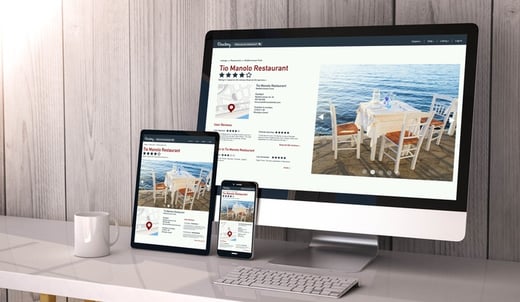
Design, layout, and color scheme are important pillars to any great website design. Your website is a reflection of your cuisine, demographic, and brand, so a wrong step in design could serve to turn off your target market. Hiring a professional to design your website is one of the best decisions you can make. If your website design is unappealing, clunky, outdated, or off-brand, potential patrons might change their mind on any interest in visiting your restaurant. And today, a big part of web design is making sure it’s optimized to be responsive to various mobile devices, screen sizes, and web browsers. More and more, people are searching for places to eat on their smartphone while on the go, so make sure your website is attractive (and easy to navigate) on mobile as well.
Having these four elements on your website will provide your customers with the information and clarity they need to dine with you. They’ll know (and see) that the quality of your food is great and that your atmosphere is welcoming. Consumers are constantly online looking for places to enjoy a meal with friends and family, so make sure that your website is designed with these four aspects to get people through the door!

